The Orangerie – Brand Identity Case Study
The Orangerie is a plant and botanical shop centered around calm, elevated, and nature-forward experiences. This project focused on developing a cohesive brand identity that reflects both the refinement of a curated retail space and the organic beauty of plant life.
Objective
The goal was to create a visual identity that felt sophisticated yet approachable—appealing to plant enthusiasts, design-conscious shoppers, and lifestyle-focused customers. The brand needed to communicate trust, quality, and a sense of tranquility while standing out in a saturated botanical market.
Concept & Direction
The concept draws inspiration from traditional European orangeries—glass conservatories designed to house and showcase plants. This influence guided the visual language toward something timeless, structured, and elegant, while still feeling fresh and modern.
A key decision was to balance botanical softness with architectural precision, creating a brand that feels both natural and refined.
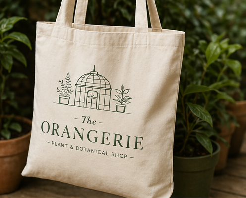
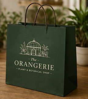
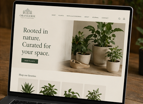
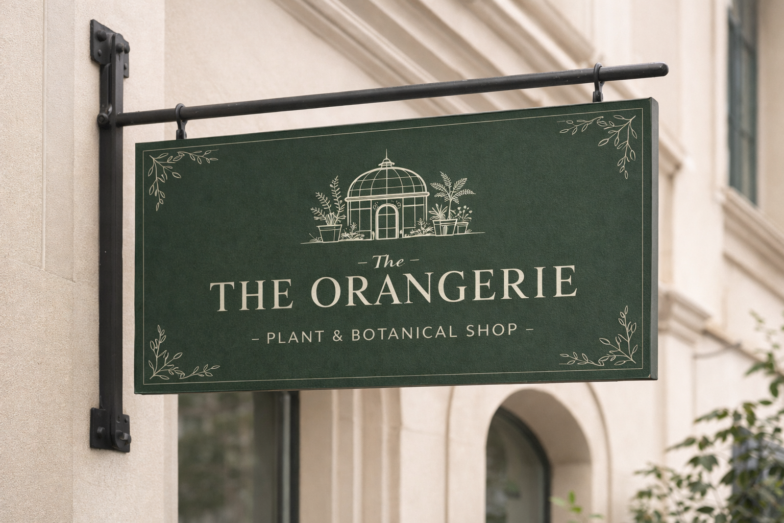
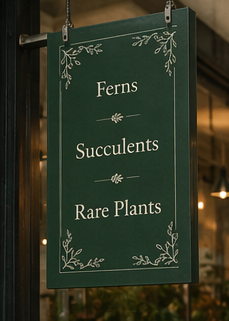
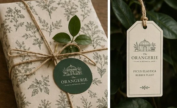
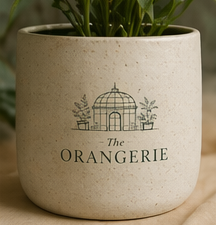
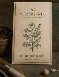
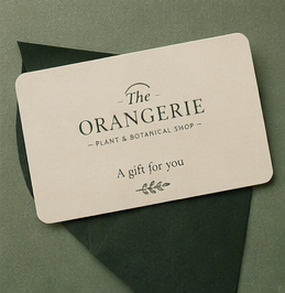
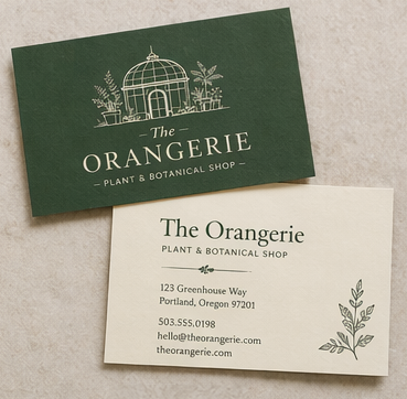
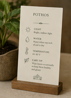
The brand was designed with real-world applications in mind, including storefront signage, packaging, and marketing materials.
Signage: The hanging storefront sign demonstrates how the brand translates into a physical space. The deep green background paired with light typography ensures visibility while maintaining an elegant presence.
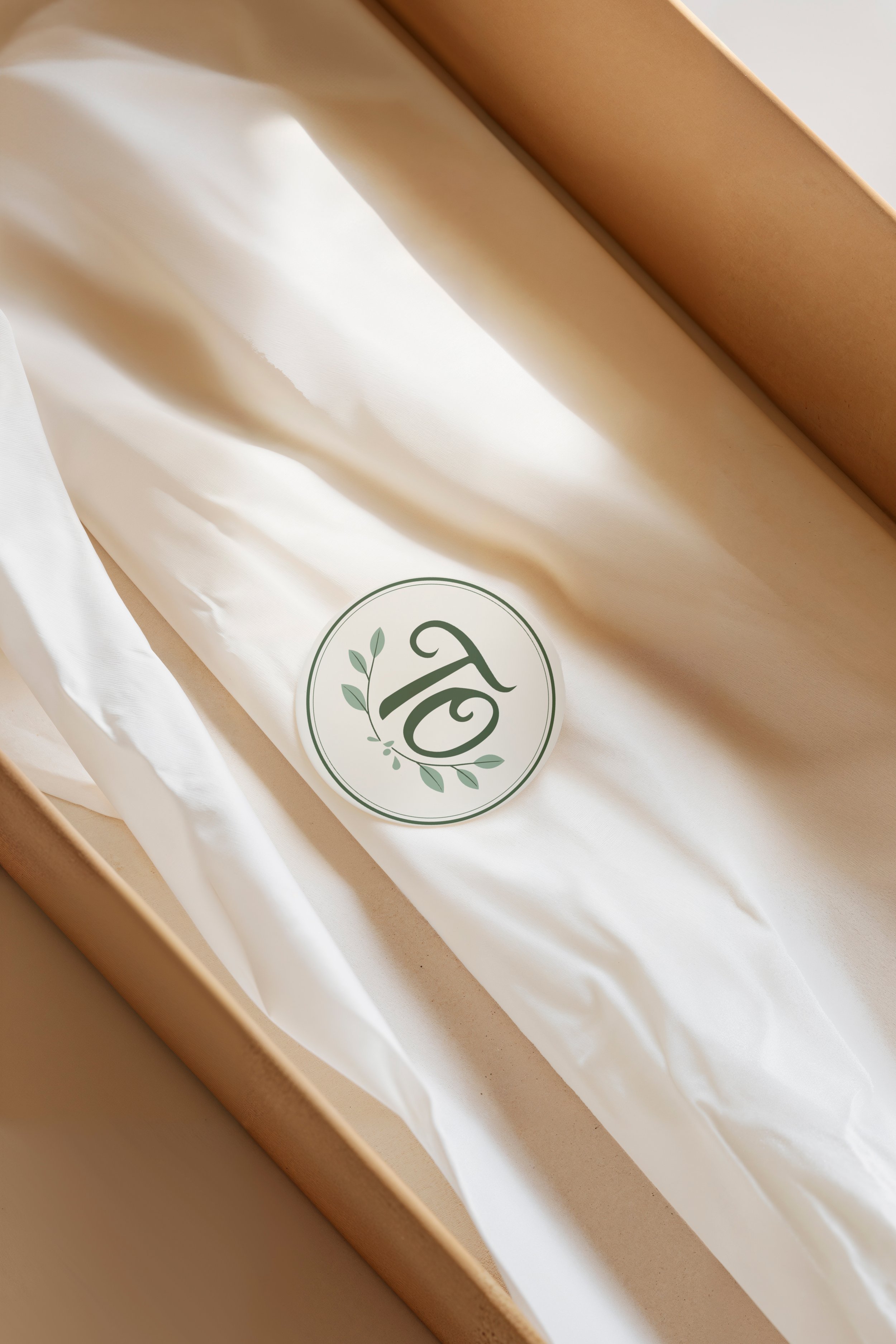
Logo Mark: The simplified logo adapts seamlessly for stamps, labels, and digital use.
Scalability: The identity holds up across sizes—from small product tags to large exterior signage—without losing clarity.
Application
Outcome
The final identity positions The Orangerie as a premium, thoughtfully curated plant shop. The branding communicates a balance of nature and design, helping the business stand out while remaining timeless and versatile.
Takeaway
This project highlights my ability to create branding that is not only visually compelling but also strategically aligned with a brand’s environment, audience, and long-term use.